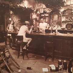
After a three year break, the mighty Led Zeppelin returned with In Through the Out Door, a record that really divided fans. To be sure, there was a definite change in direction in sound, most notably prominent keyboards and diminished guitars. I have always had mixed feelings about this LP. If I am in the right mood, I really like it, but it's not the first Zeppelin record I would reach for.
Sadly, this was the band's final studio recording. Coda came later, but that was a collection of odds and sods, two or three of which would have improved ITTOD immensely. Even more sadly, John Bonham died about a year after the record was released, and that killed my plans to somehow get to Toronto and finally see the band in concert. He was only 32 years old.
I've read that the change in sound had a lot to do with the greater influence of John Paul Jones and Plant, while Bonham was struggling with alcoholism and Page was in full heroin mode. It made for an odd record in some ways, yet it was very popular. I really do love this record, but I prefer the heavier Zeppelin. Also, I kind of hate the song Hot Dog.
"The original album featured an unusual gimmick: the album had an outer sleeve which was made to look like a plain brown paper bag (reminiscent of similarly packaged bootleg album sleeves with the title rubber-stamped on it), and the inner sleeve featured black and white line artwork which, if washed with water, would become permanently fully coloured. There were also six different sleeves featuring a different pair of photos (one on each side), and the external brown paper sleeve meant that it was impossible for record buyers to tell which sleeve they were getting (there is actually a code on the spine of the album jacket which indicated which sleeve it was—this could sometimes be seen while the record was still sealed). The pictures all depicted the same scene in a bar (in which a man burns a Dear John letter), and each photo was taken from the separate point of view of someone who appeared in the other photos. The walls are covered with thousands of yellowed business cards and dollar bills. The photo session in a London studio was meant to look like a re-creation of the Old Absinthe House, in New Orleans, Louisiana.I have a 'C' album cover, by the way. Everything Zeppelin did was awesome, but this is a little less awesome that what cam before it.
The album artwork was designed by Hipgnosis. Storm Thorgerson recalls the design in his book Eye of the Storm:
The sepia quality was meant to evoke a non-specific past and to allow the brushstroke across the middle to be better rendered in colour and so make a contrast. This self same brushstroke was like the swish of a wiper across a wet windscreen, like a lick of fresh paint across a faded surface, a new look to an old scene, which was what Led Zeppelin told us about their album. A lick of fresh paint, as per Led Zeppelin, and the music on this album... It somehow grew in proportion and became six viewpoints of the same man in the bar, seen by the six other characters. Six different versions of the same image and six different covers.And:
Did you ever notice you could affect the dust jacket by putting water on it? If you applied spittle to it or a bit of water, it would change colour, like a children's colouring book we based it on. But we didn't tell anybody. I don't think Zeppelin told anybody, either.In 1980, Hipgnosis were nominated for a Grammy Award in the category of Best Album Package for In Through the Out Door." [source]
No comments:
Post a Comment